Mastering the Art of Coordinating Colors and Tones Flawlessly
Have you ever looked at a room or an outfit and wondered how some people seem to effortlessly put together colors and tones that just work? They create a harmonious and beautiful look, while yours may end up looking mismatched and uncoordinated. The secret to achieving that perfect balance lies in mastering the art of coordinating colors and tones flawlessly. In this article, we will take a deeper look into what this art is all about and how you can become a pro at it.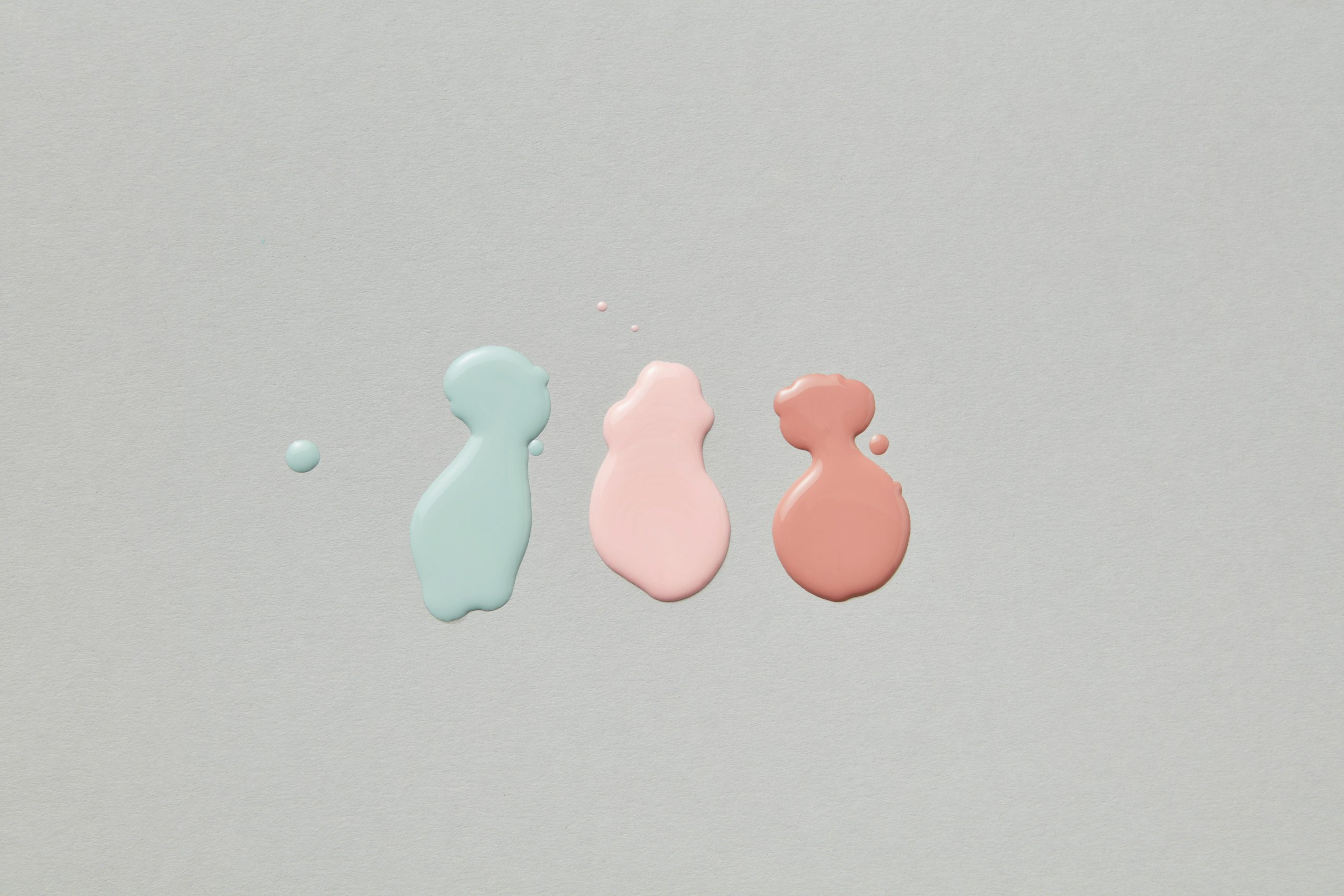
Understanding the Basics of Color Theory
Before we dive into the specifics of coordinating colors and tones, it is essential to have a basic understanding of color theory. Colors can be divided into three main categories: primary, secondary, and tertiary. Primary colors are red, yellow and blue, which cannot be created by mixing other colors. Secondary colors, such as orange, purple and green, are created by mixing two primary colors. Tertiary colors are a combination of a primary and secondary color.
When coordinating colors, you need to consider not only the hue, but also the tone, saturation, and brightness. The hue is the dominant color, whereas the tone refers to the lightness or darkness of the color. Saturation is all about the intensity of the color, while brightness is how light or dark the color is. By understanding these elements, you can create a visually pleasing and well-balanced color scheme.
The Key to Coordinating Colors and Tones Flawlessly
One of the key principles of coordinating colors and tones is using the color wheel. The color wheel is a circular diagram that shows the relationship between colors based on their hues, tones, and brightness. It is an essential tool for any designer, whether it be for interior design, fashion, or graphic design.
To create a harmonious color scheme, choose colors that are adjacent to each other on the color wheel. This is known as an analogous color scheme and creates a cohesive and natural look. For example, you can pair various shades of blue-green with a green-yellow or violet-red. This creates a visually pleasing and balanced look as the colors are closely related.
Another method is to use complementary colors, which are colors that are opposite each other on the color wheel. This creates a high contrast and adds energy to your color scheme. For instance, you can pair a warm tone, such as red, with a cool tone, such as green. This creates a striking contrast that can make your design stand out.
Applying the Art to Your Design
Now that you understand the basics of color theory and how to use the color wheel, it is time to apply this knowledge to your design. Whether it is for your home, outfit, or graphic design project, here are some tips to help you master the art of coordinating colors and tones flawlessly.
Start with a Color Palette
Before you start choosing colors, it is essential to have a color palette in mind. This will help guide your choices and create a cohesive look. You can create a color palette by choosing a dominant color and then selecting two or three complementary or analogous colors to accompany it.
Consider the Mood or Theme
The colors you choose can evoke different emotions and convey a specific theme or mood. For example, warm tones, such as red, orange, and yellow, can create a cozy and inviting atmosphere, while cool tones, like blue and green, can create a serene and calming ambiance. Consider the mood or theme you want to achieve when selecting your color palette.
Experiment with Shades and Tones
Don’t be afraid to play around with shades and tones of the same color. This can add depth, dimension, and interest to your design. For example, you can use a dark shade of blue for your walls and a lighter shade of blue for your furniture or décor accents.
Don’t Forget the Neutrals
Neutral colors, such as white, black, and grey, are essential in any color scheme. They provide balance and prevent your design from becoming overwhelming. You can use neutral colors as a base or as accents to complement your chosen color palette.
Conclusion
Coordinating colors and tones can seem like a daunting task at first, but by understanding the basics of color theory and using the color wheel, you can master this art and create beautiful and balanced designs. Remember to start with a color palette, consider the mood or theme, play around with shades and tones, and don’t forget to include neutral colors. With these tips, you can coordinate colors and tones flawlessly and create a visually stunning design every time.